LOG Design System
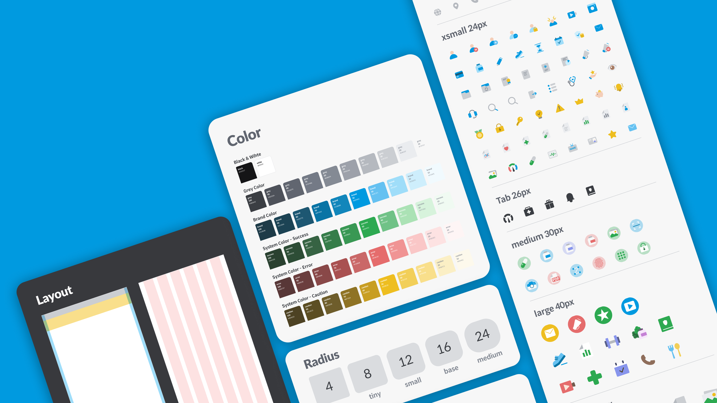
LOG Design System is a comprehensive design system for the LOG app interface.
It streamlines design through pre-built components and provides consistent UI and enhances user experience.
ROLE
Product Design Lead
TIMELINE
January 2022 (8 Months)
Figma
Adobe Illustrator
TEAM
2 Product Designers
5 Front-end Engineers
TOOLS
• Transitioned design tools from Sketch to Figma to configure the design system.
• Led communication with developers based on component guide documentation.
• Managed the design domain from native app (Android, iOS) to responsive web.
CONTRIBUTION
Why constructed LOG Design System
The LOG app, launched in 2019, has gradually grown into a super app with various services over time. However, with the addition of new services, the readability of information has decreased and the focus on content has been lost. The design lacked standards, which reduced the efficiency of both development and design teams. To address these issues, the LOG Design System was created to provide a consistent app experience to users.
Establish
LOG identity
Consistent UI
Increase
work efficiency
Design at scale
Increased design & development work efficiency
The design principal was created according to the LOG app’s tone and manner.
Design principal
Trustworthy
Lively
Friendly
Foundation
LOG Design System defined fooundation like this
Three main colors as a basis for its color scheme. These colors are used to determine the system colors and illustration colors as well. The brand 50 color is a distinctive color that represents the identity of the LOG app. The app background is set to white, while the font color is gray100.
Color
3 LOG Main Color
LOG Color
Added normal, caution, and danger system colors to indicate the user's health status.
Illust Color
Added illust colors to be used in illustration graphics
Icons that were previously expressed as lines were filled with colors to give a warm feeling, and a consistent design was implemented by unifying the size and color of different icons for each tab.
Icon
xxsmall 16px
xsmall 20px
medium 30px
large 40px
xlarge 50px
Improved overall readability by distinguishing the importance of content.
Typography
Components
We guide the design by matching the size and situation used in the app, such as List, Button, and Input.
Box Base Input
Buttons
Modal
Bottom Sheet
List_Insurance
List_Certificate
List_Import check-up result
List_Inquiry
Fixed Tab
Scrollable Tab
Navigation Bar : Bottom
Navigation Bar : Top


